Project Details
This project was for THE hotel, the hipper, quieter sister to the attached Mandalay Bay Resort. A dream project, the challenge was to create a new, more upscale level of branded product for the on-site new store opening at the time. The project incorporated Line Planning & Merchandising, Product Design & Development, Product Sourcing & Production, & everything in between, right through to the store’s Visual Presentation & Retail Execution. A great part of this process involved conceiving the concepts to retail, then seeking out the right resources for manufacturing, both through brand collaborations and designing new products from start-up to final execution, to incorporate into the mix across all product categories.
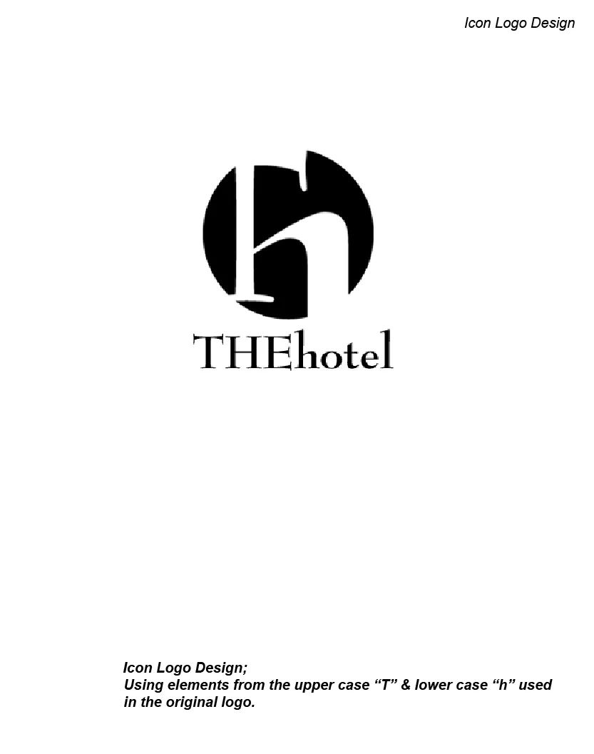
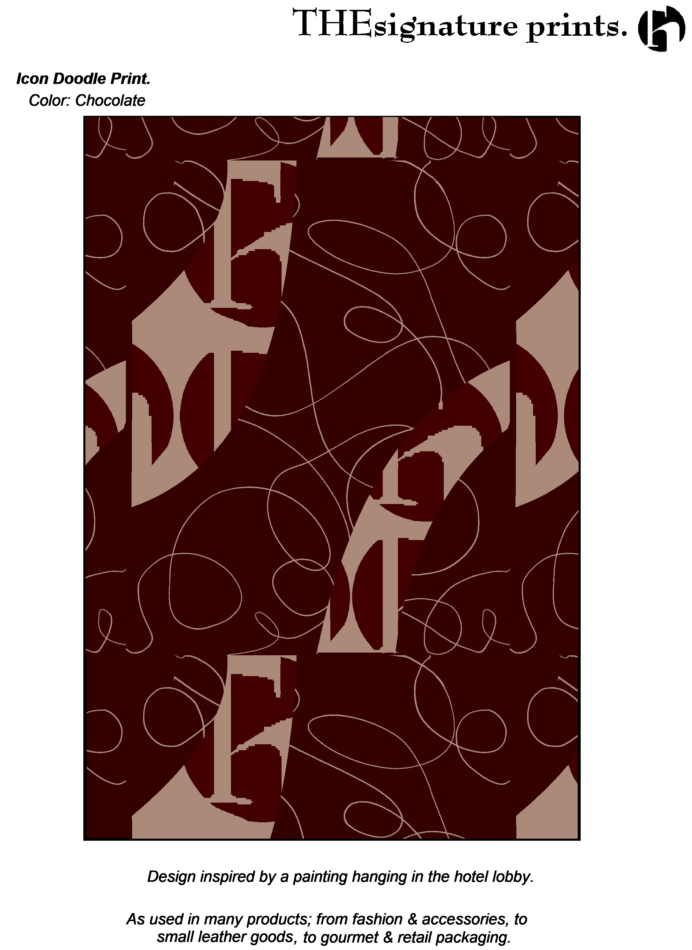
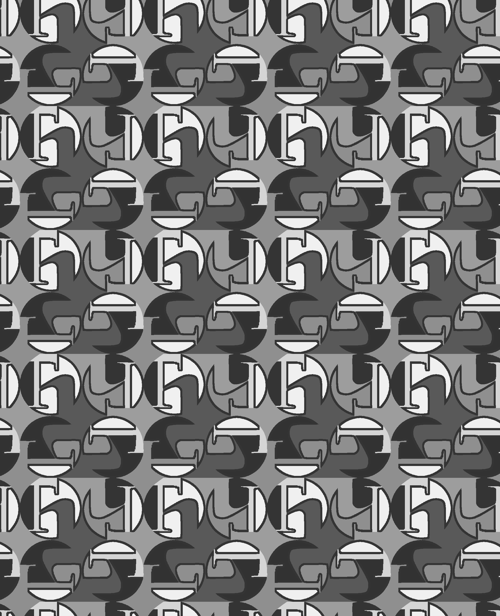
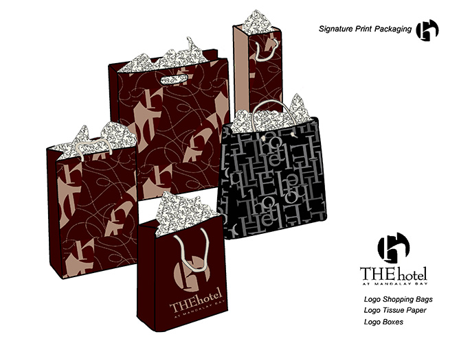
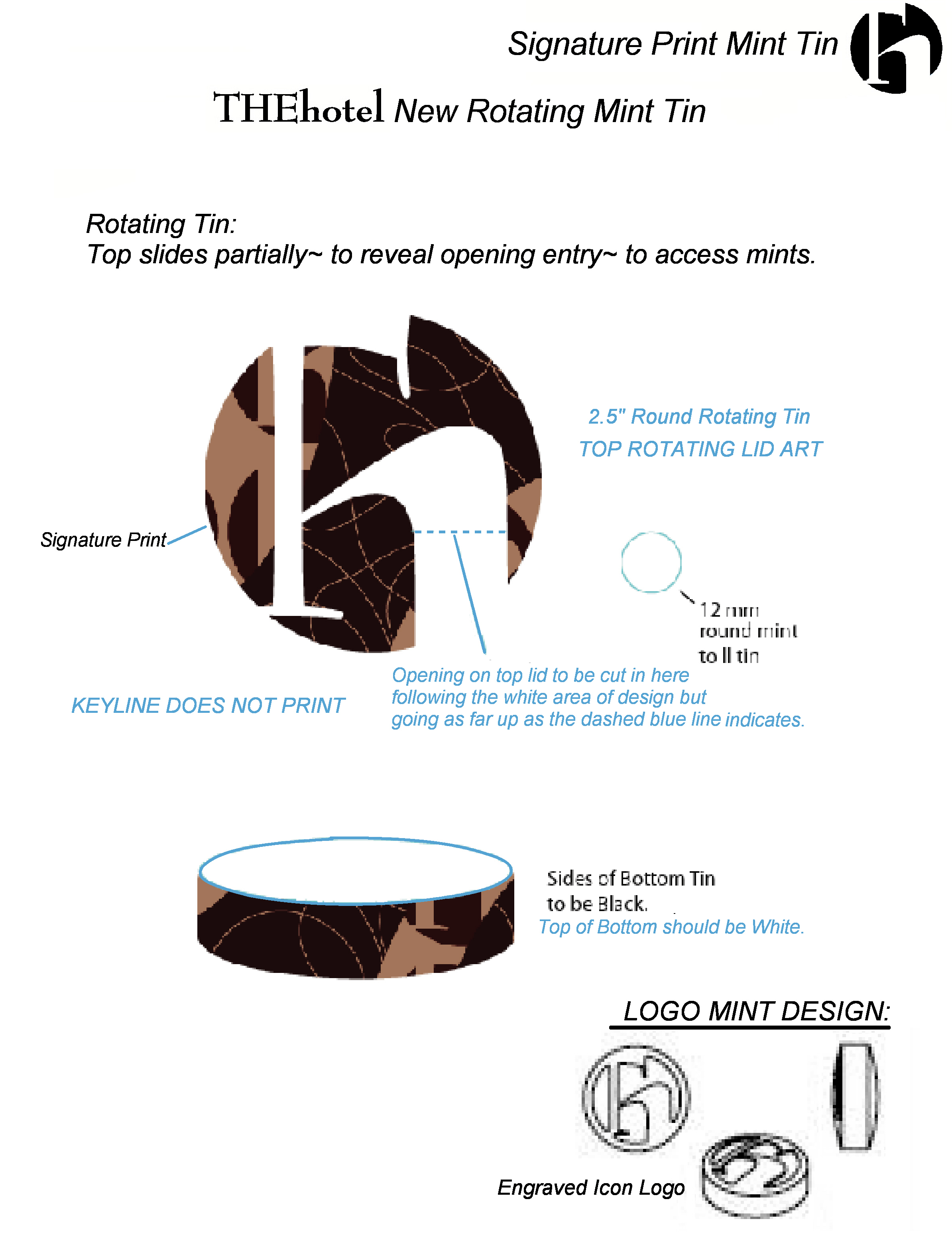
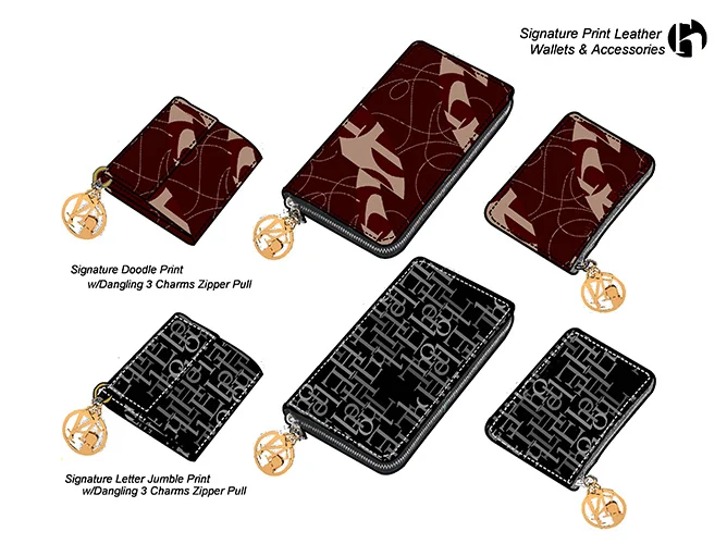
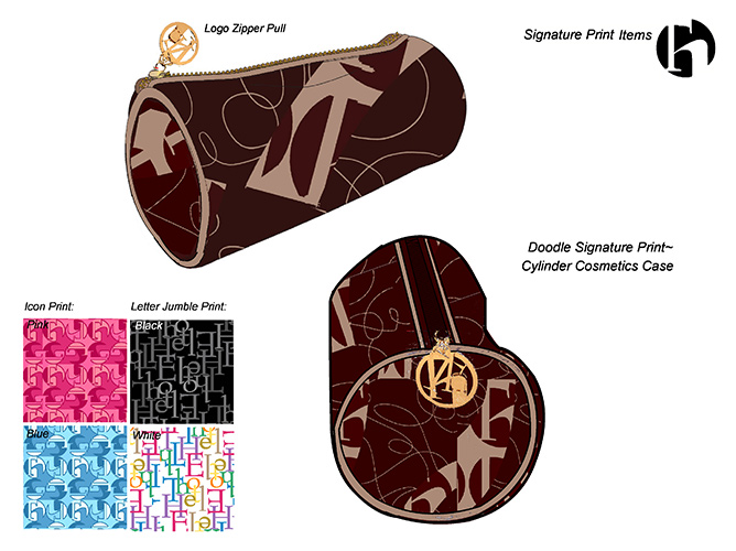
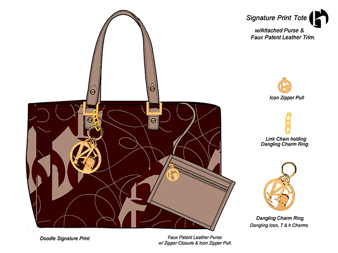
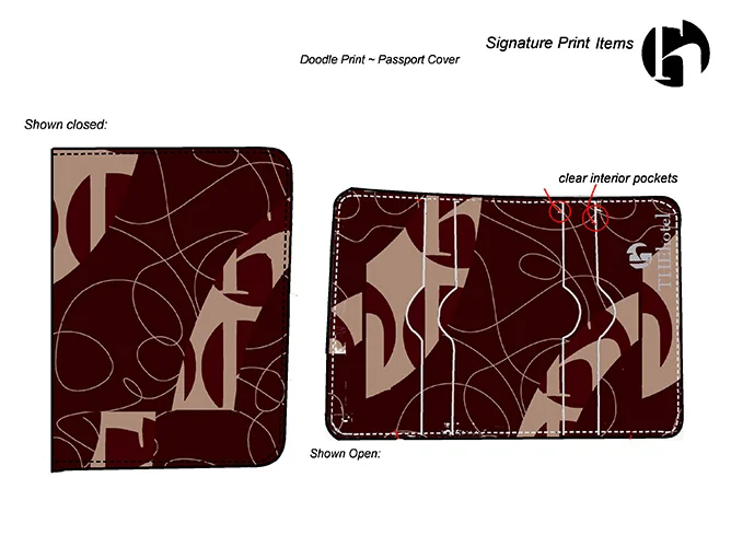
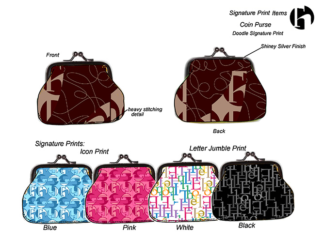
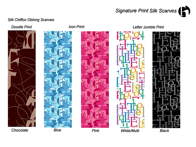
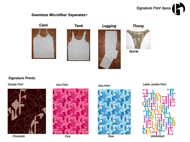
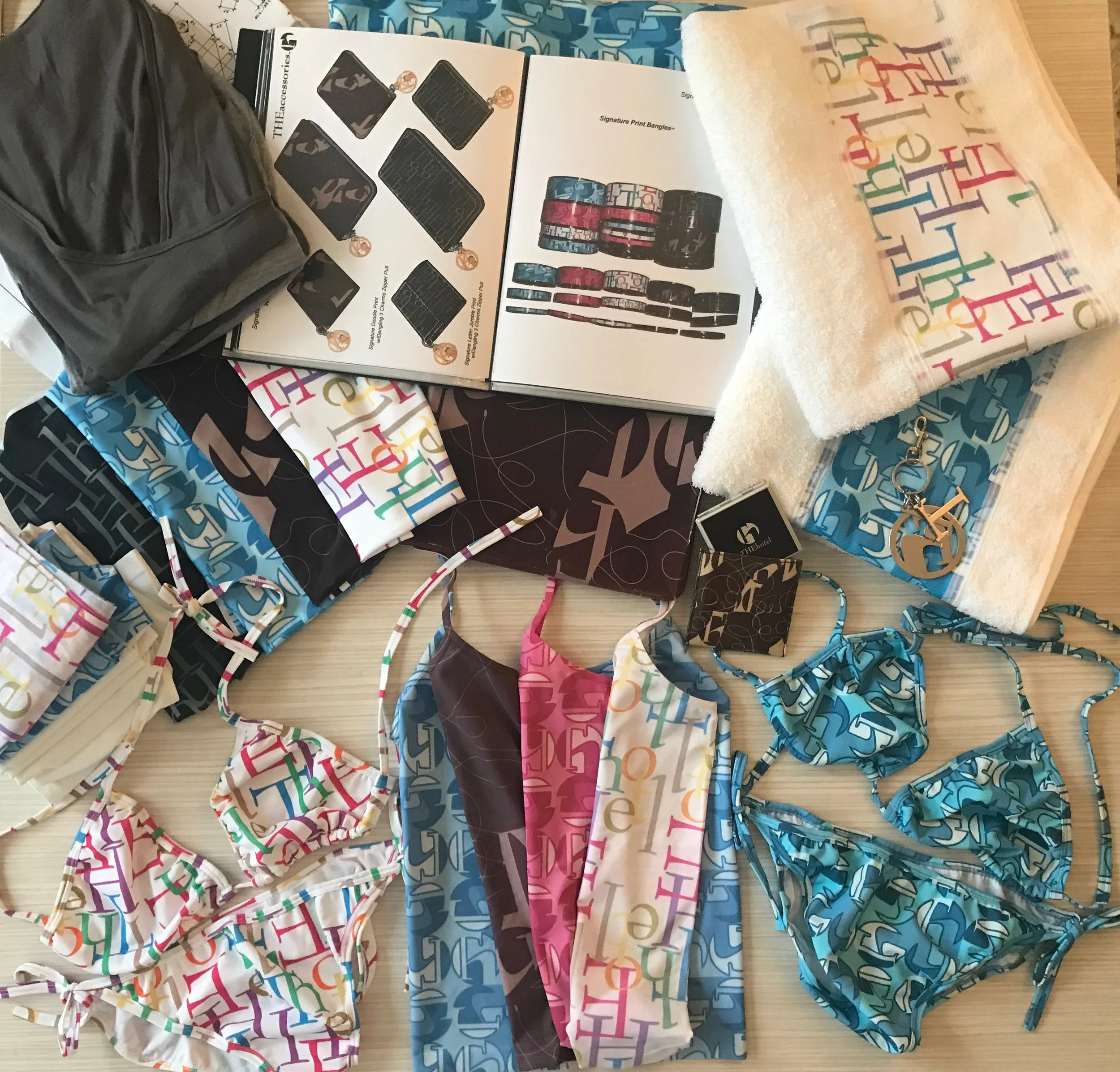
At the request of the hotel’s president, we were challenged to come up with a new visual brand identity, using one of his favorite paintings hanging in the lobby as inspiration. To that end, we first designed a new Icon Logo, incorporating the brand’s current mark, & a Signature Print integrating this new Icon together with elements inspired by his favorite painting. This is the Doodle Print, seen in the accompanying slides.
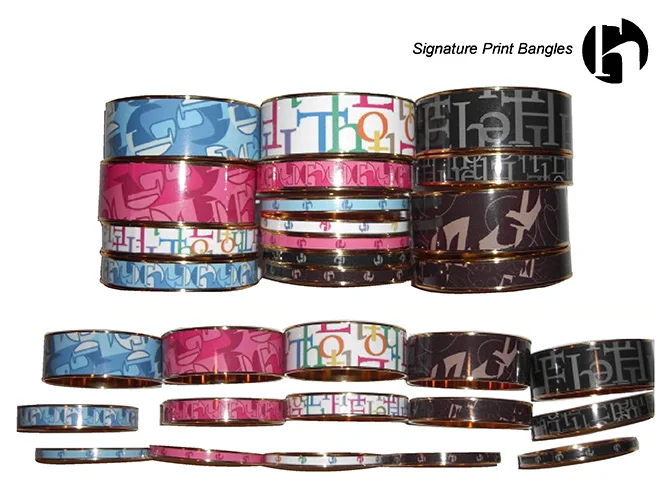
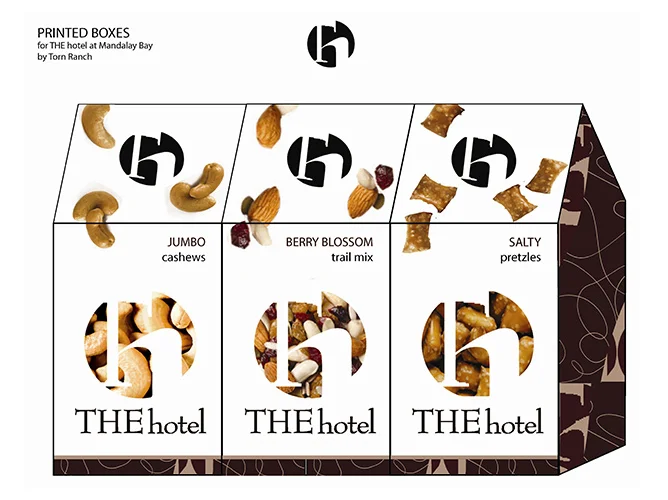
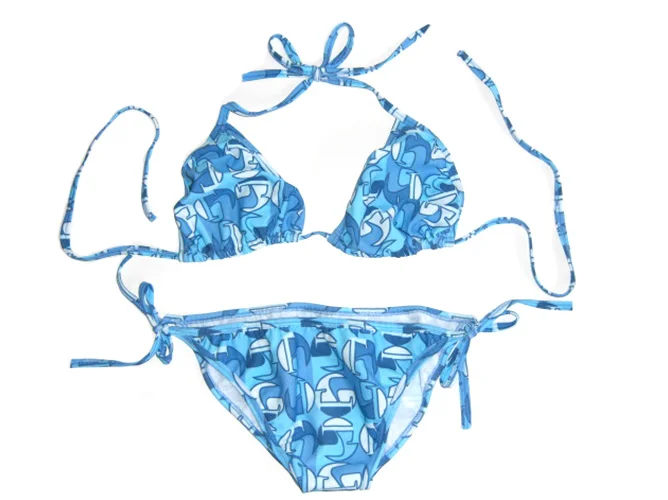
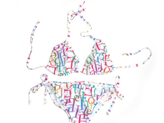
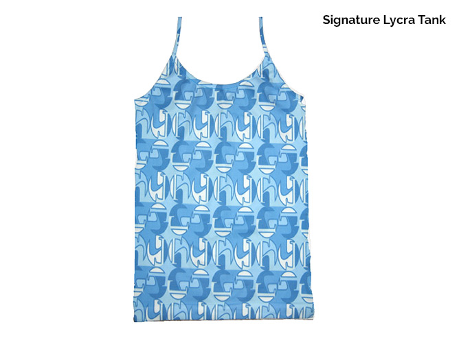
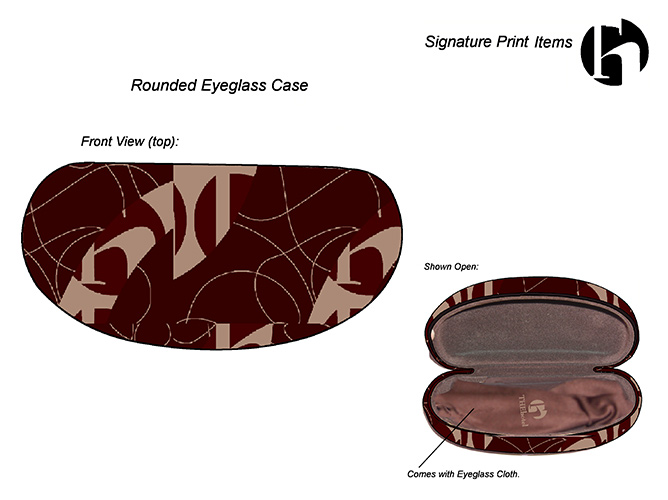
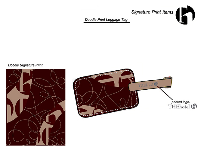
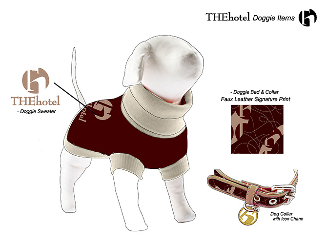
I designed several Signature Prints and then applied them throughout different categories of product for retail; from apparel & accessories, to gourmet food packaging, to gifts & jewelry, to the store’s packaging. You can see the Signature Prints & their products in the accompanying slides. Products such as seamless camis, tanks, leggings & lingerie; to silk scarves, to small leather goods like passport covers & luggage tags, wallets & totes; fun bangle bracelets; bikinis & giant pool towels; even branded items for your dog, to name a few.
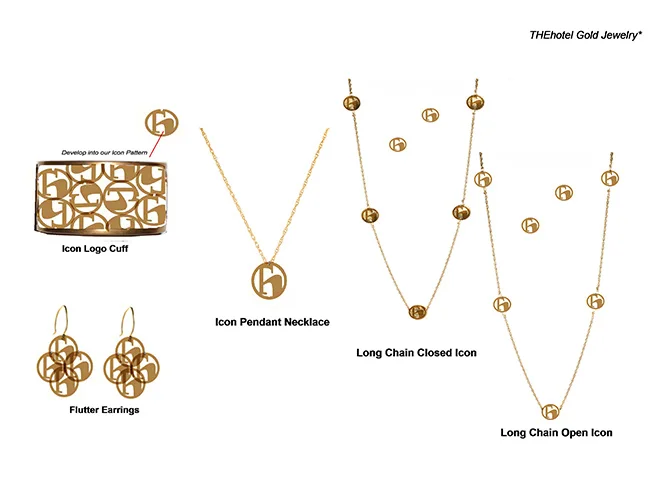
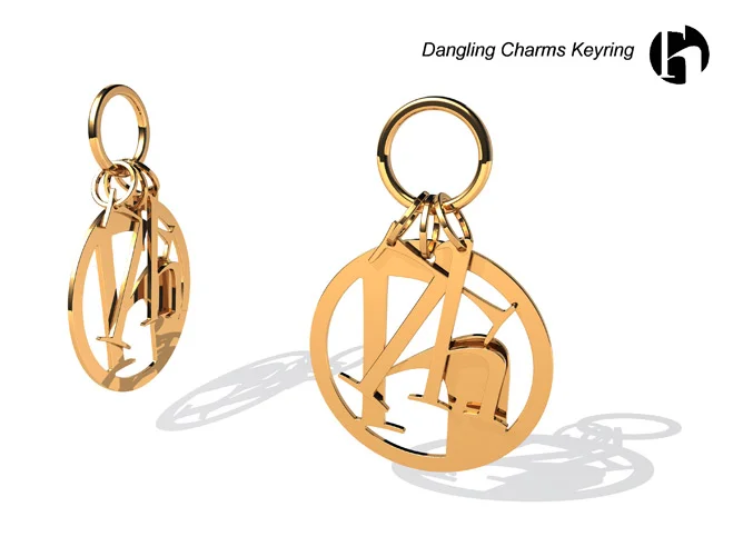
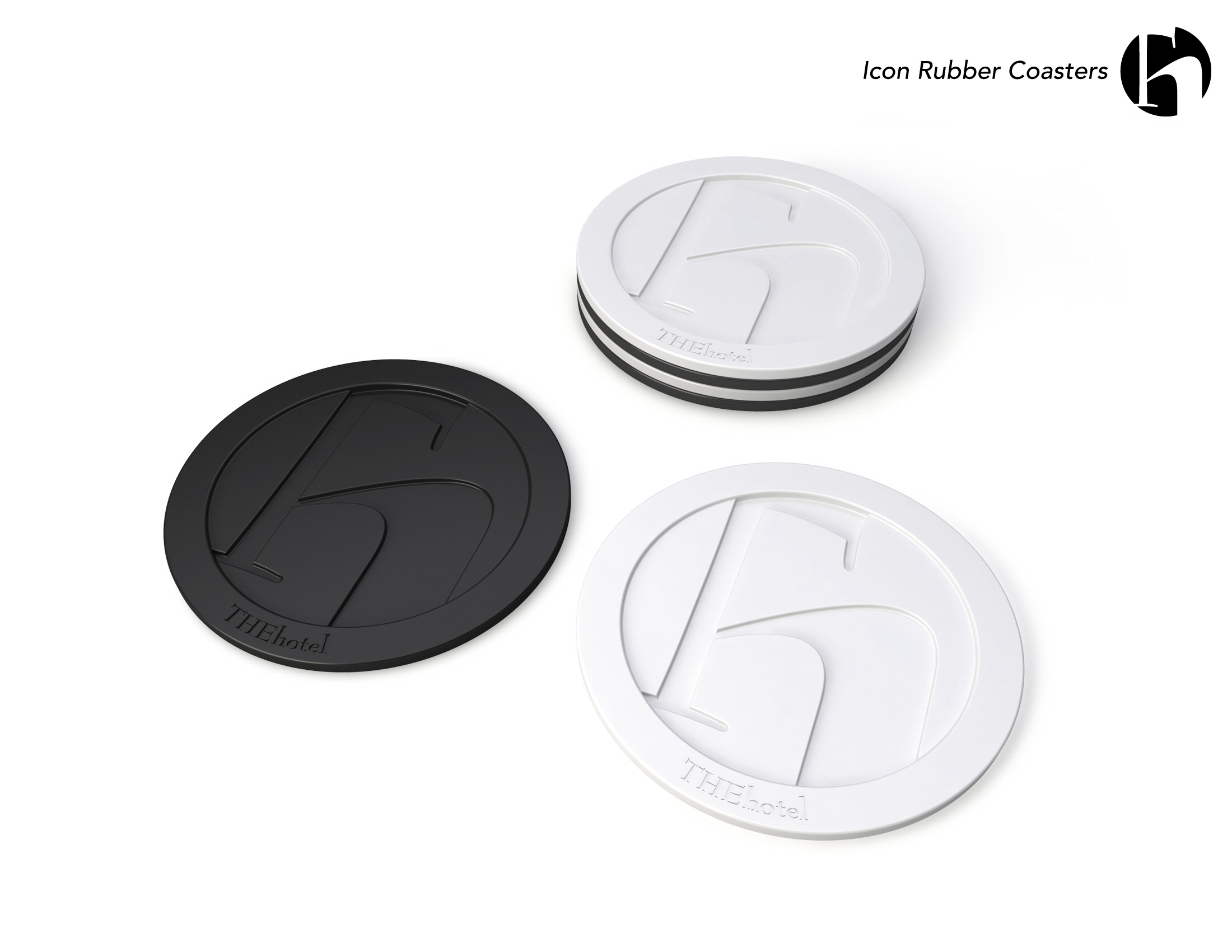
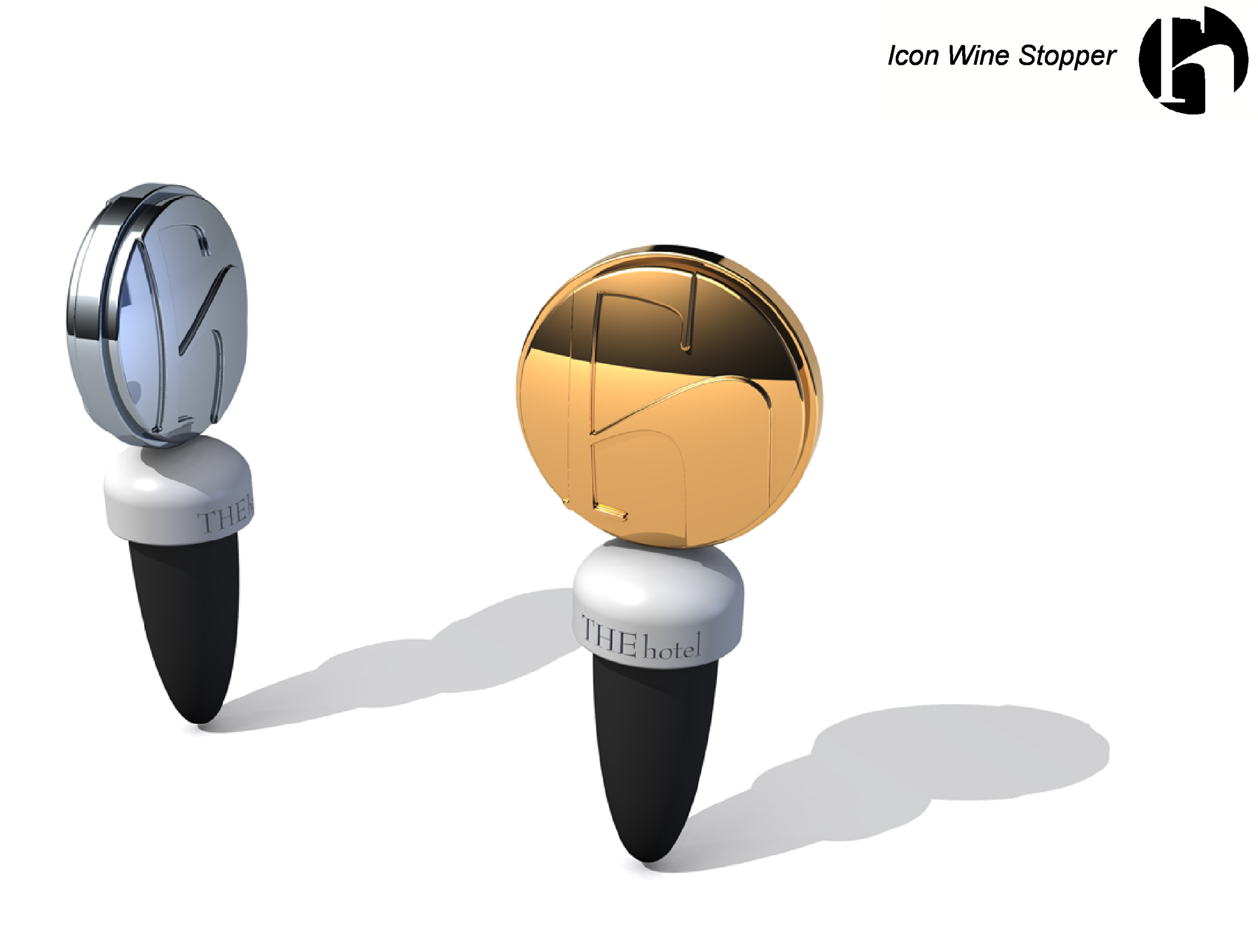
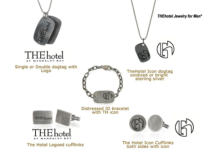
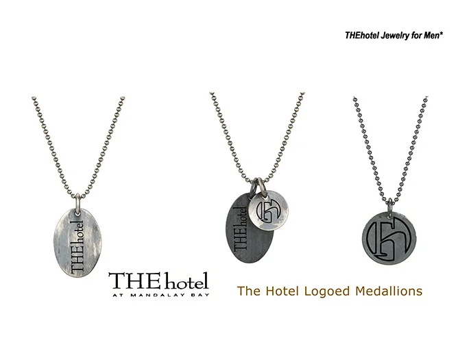
I developed the Icon logo itself into sleek new products; Gold & Silver Wine Stoppers, to cool Jewelry- Gold Vermeil for her & Oxidized Sterling Silver for him; or fun gifts like a set of black & white Rubber Coasters taking the shape of the new Icon logo.
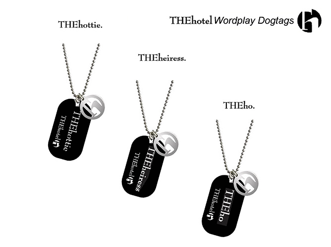
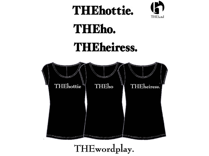
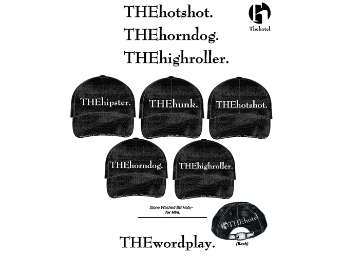
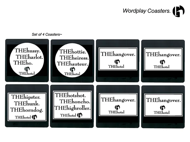
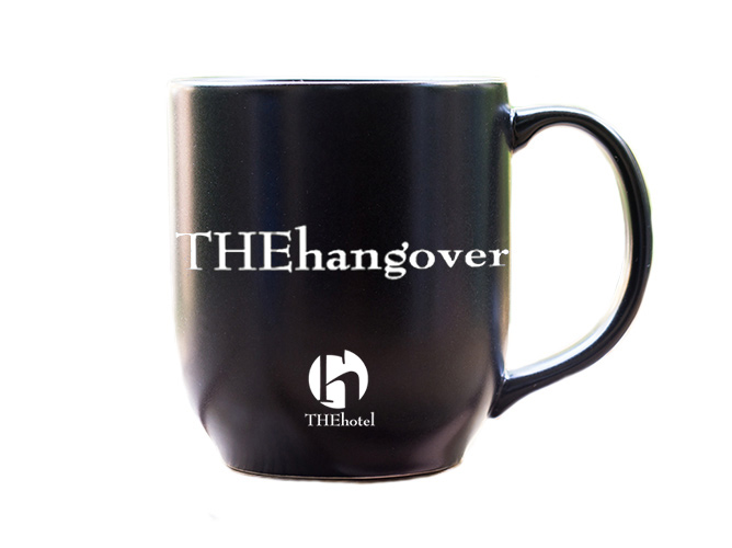
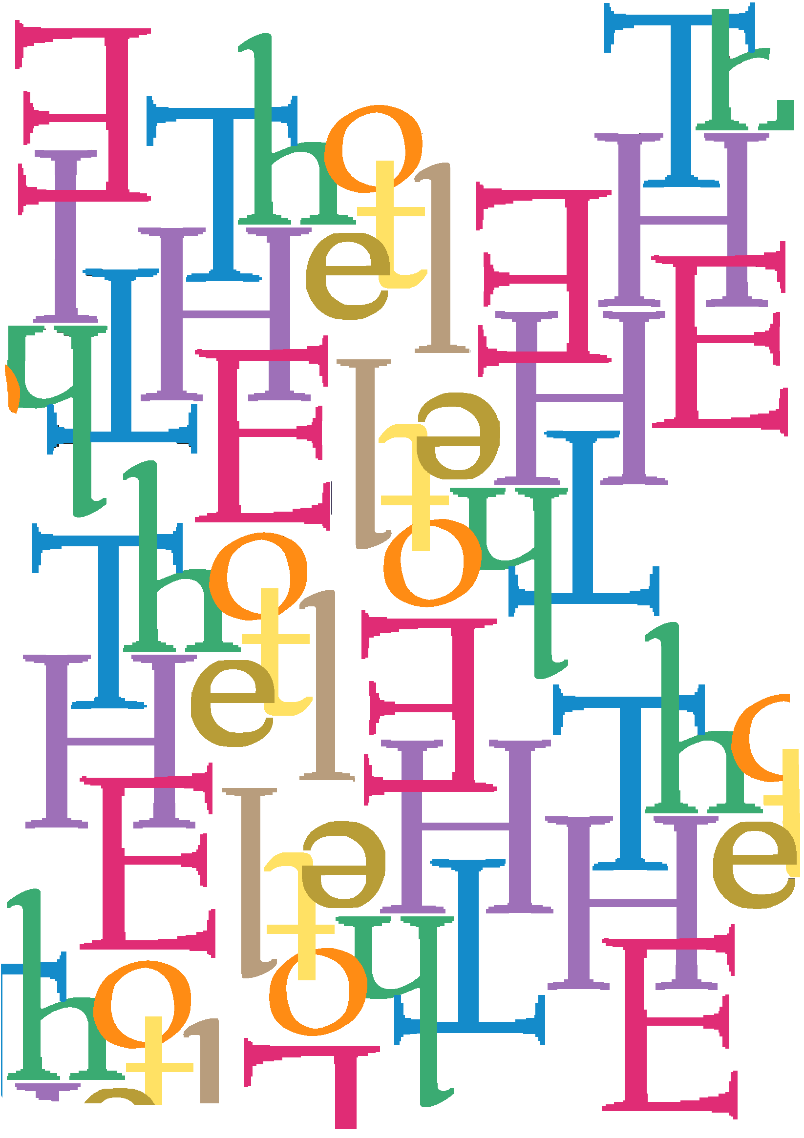
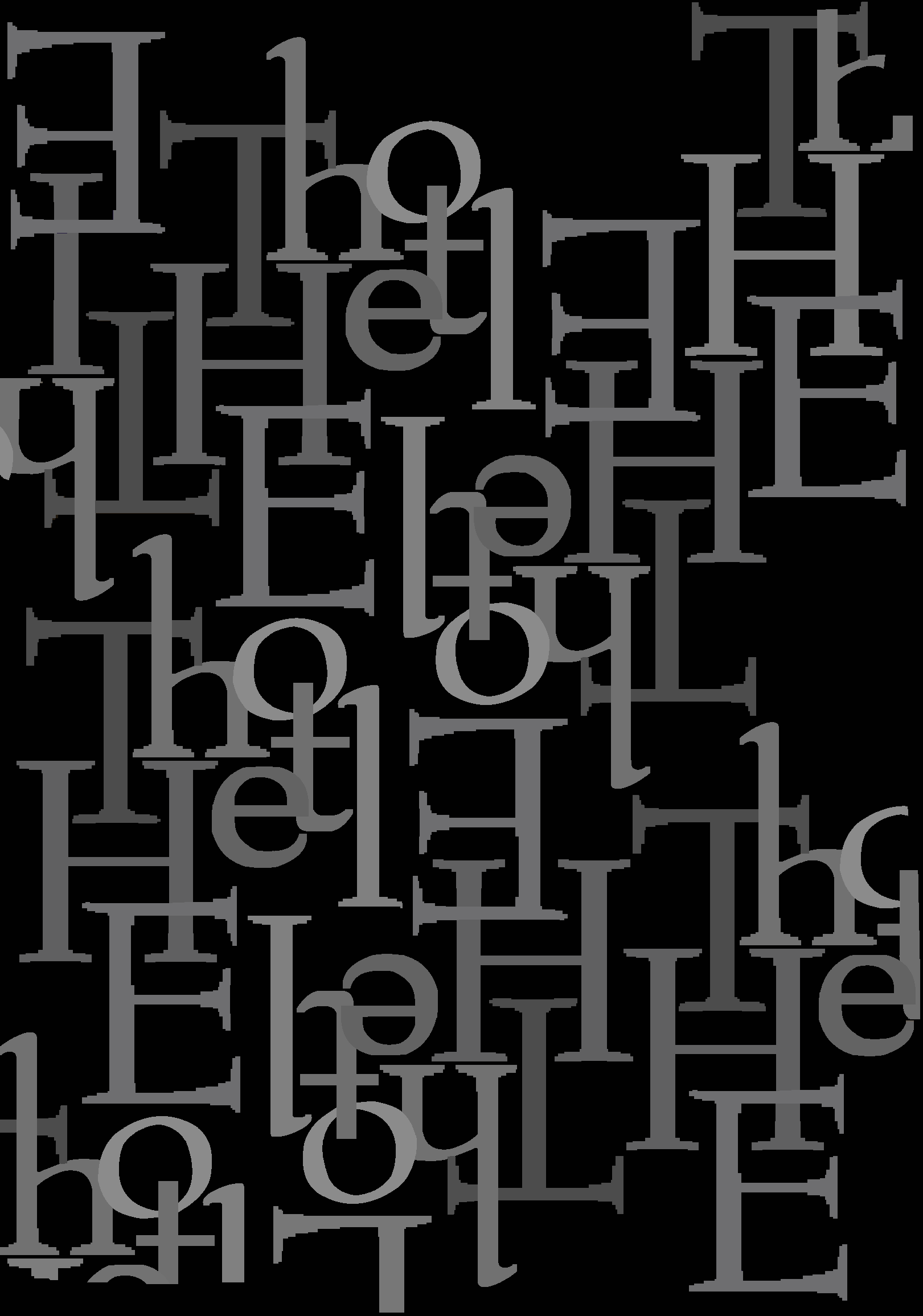
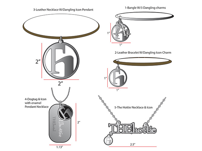
Another fun concept was THE wordplay….Taking cues from the name & spelling of THEhotel, we came up with a fun play on words and wrote them out the same way; always with ‘THE’ in upper case & the second word always starting with ‘h’, in lower case, same as THE hotel mark. ie: THE ho, THE hottie, THE hipster, THE hangover….you get the picture. This was applied to products like tee shirts & BB Caps, to bracelets & necklaces, to totes, to cocktail coasters, etc… all in black & white; Very graphic & full of whimsy, as seen in the accompanying slides.
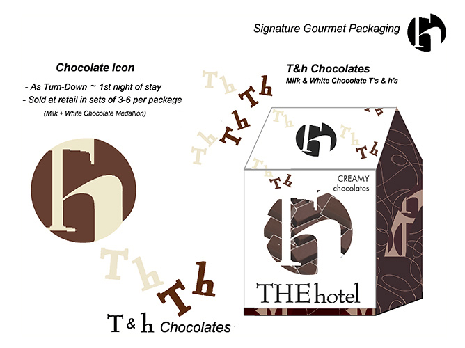
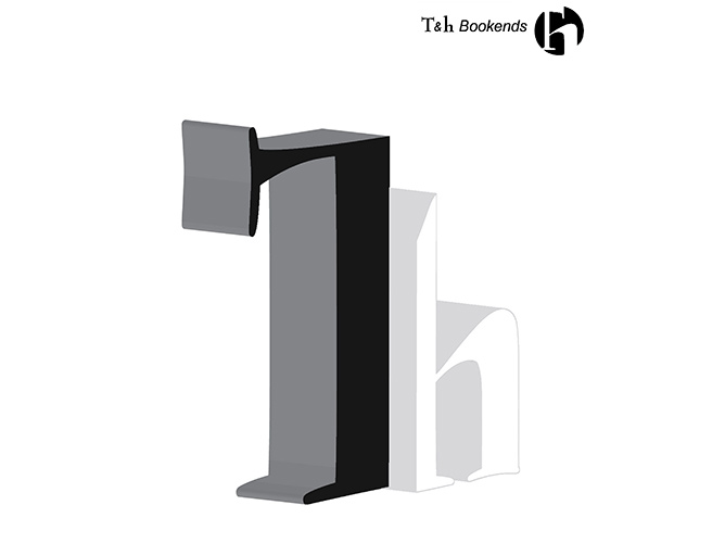
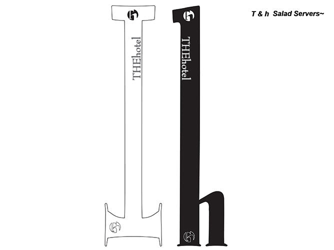
I conceived several other concepts, creating framework for new merchandise. One concept was creating items that sold in sets of 2; one ‘T’ & one ‘h’. Literally the same ‘T&h’ used in the new icon logo. ie: T&hBookends, T&h Salt & Pepper Shakers, T&h Salad Servers, etc….
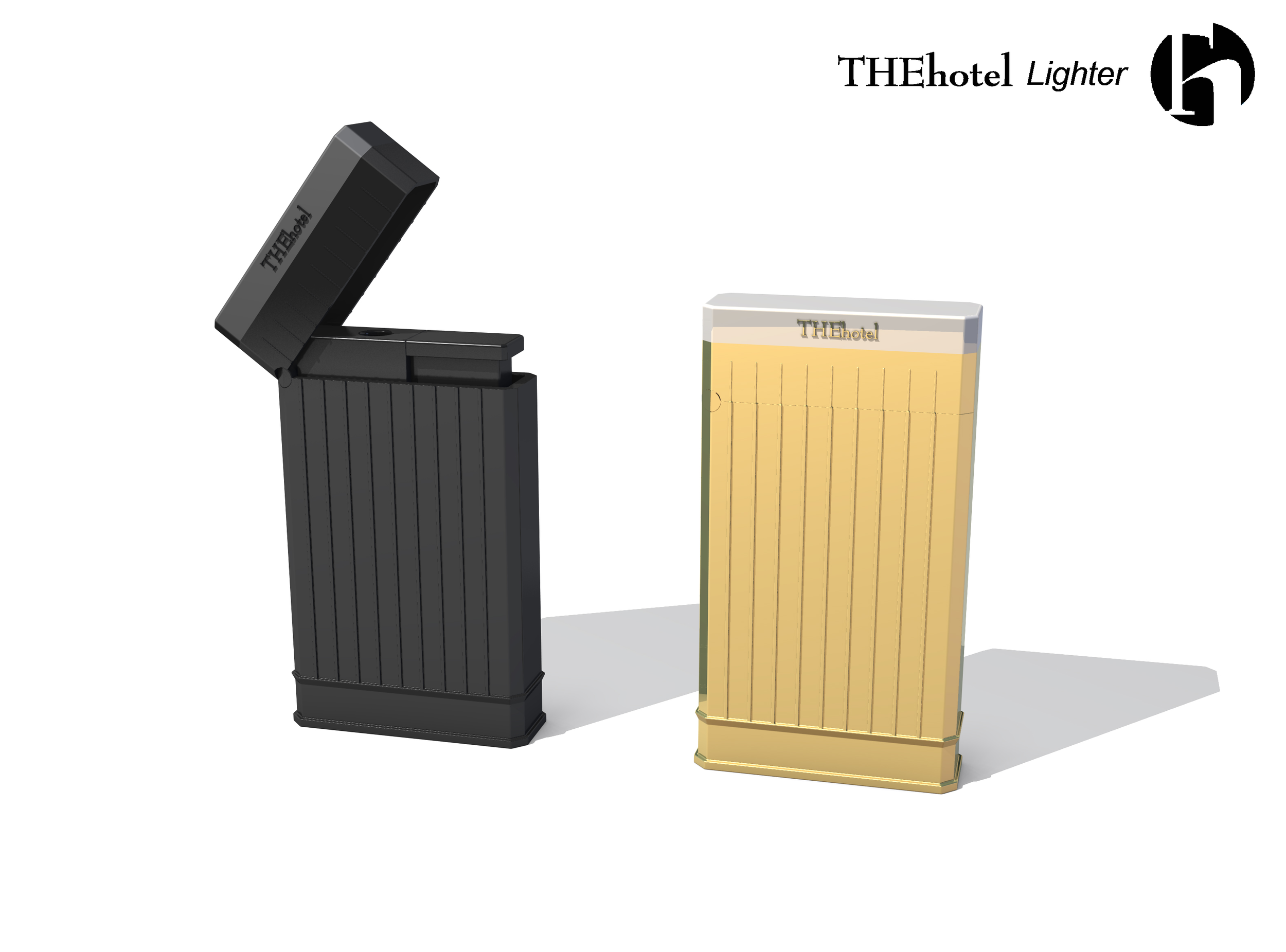
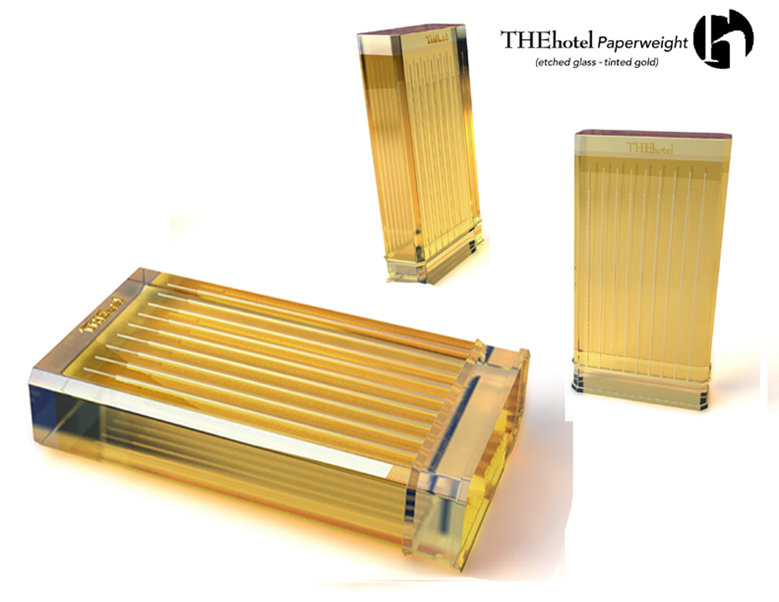
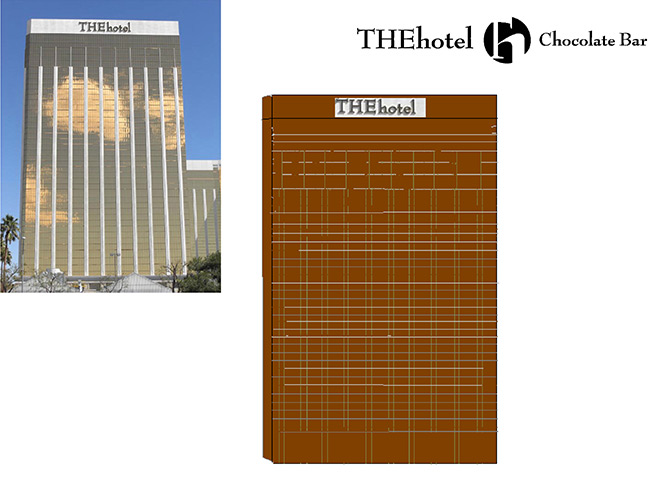
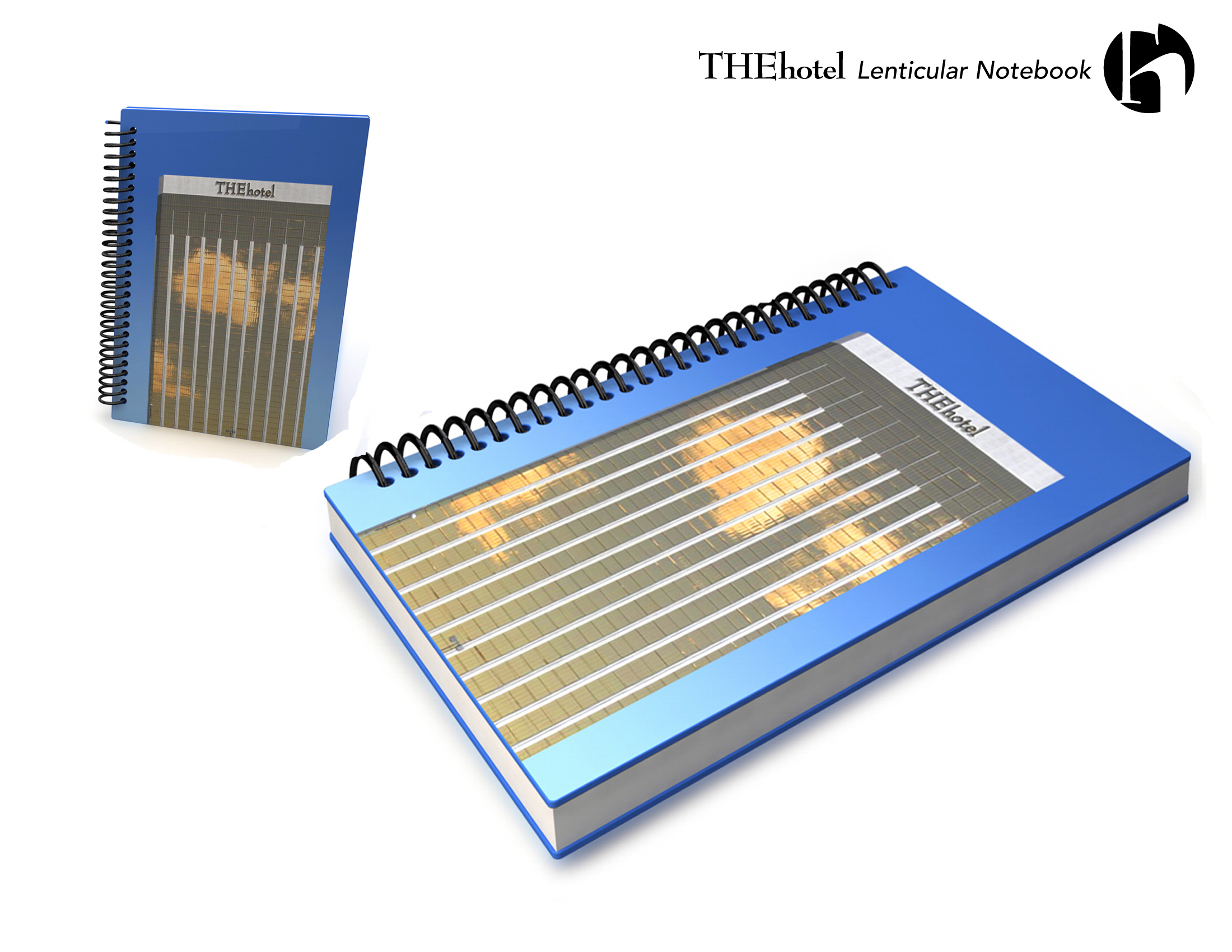
There were also items designed in the shape of the actual hotel building itself; ie: a giant hotel chocolate bar, a beautiful lighter in the shape of the building, or a giant paperweight, etched glass & tinted gold, taking the shape of the hotel; as seen in the accompanying slides.